
Brand Concept
Dongwon Group's brand identity represents the group's core values and nature. In this ever-changing world, we are firmly committed to providing greater value to society through healthy food, and by leading the 21st century's food culture.
Brand Name
Our name "Dongwon" reflects how we constantly challenge ourselves to create new value and lead in the East Asian business world. This involves successful integration of life and technology in this modern age.
Color
Our main color, blue, stands for our modernity, customer-orientation, and confidence. We have named this color "Dongwon Blue," which succeeds our previous color, navy blue, to indicate we hold the legacy of the original Dongwon Company.
Identity
Our identity is expressed through our logo and symbol named "Global Dongwon." These two marks represent Dongwon Group's core values.
Font
The round and refined font specially developed for Dongwon Group is well suited to a customer-oriented and provides a friendly image of Dongwon. The bold font represents our company’s principles and legacies
Symbol
Dongwon Group's symbol expresses its international footprint through our wide-ranging products and services intended to enrich the lives of those purchasing our products.
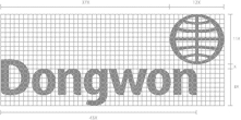
LOGO TYPE
Dongwon's identity is a combination of our font and symbol, making a unique logo for our brand. These two elements should appear together at all times.
Dongwon's logo type is strong and unique. The combination of Dongwon's symbol and signature represents our innovative and dynamic activity. Dongwon blue and Dongwon light blue symbolizes our business reaching beyond the blue horizon of the ocean.
SIGNATURE
Always use the digital master artwork when reproducing our CI. Recreating or adapting our logo is prohibited.
CI Download